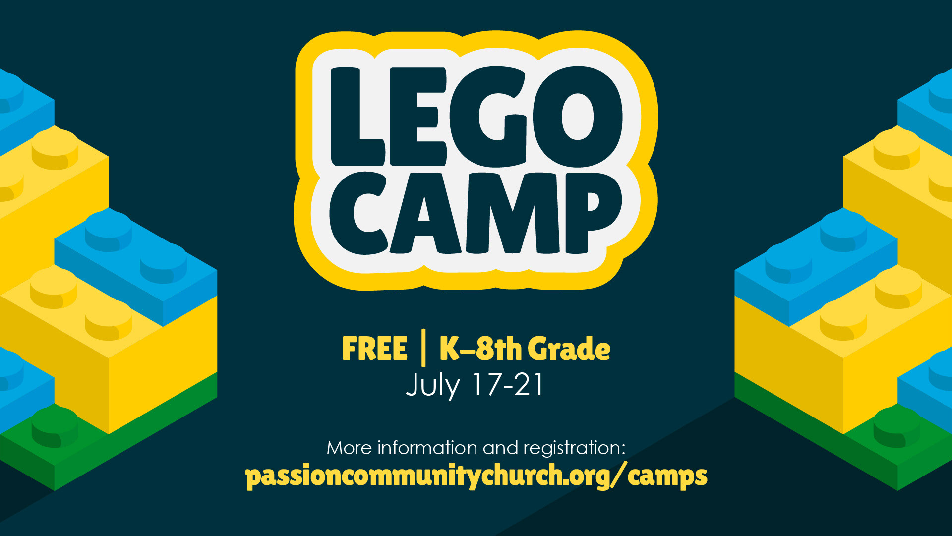
In the Summer of 2023 I was tasked with helping my church to create a visual identity and promotional assets for the summer Lego camp they were holding. Below is the initial identity and branding that I created for the event.
I wanted to create a bubbly and fun look with the word mark logo and in the display typeface choice. The blue colors match the overall church branding, while the yellow and pop of green in the illustration tie in colors of classic lego bricks. I also created a few illustrated assets in an isometric style as it is reminiscent of the visuals included


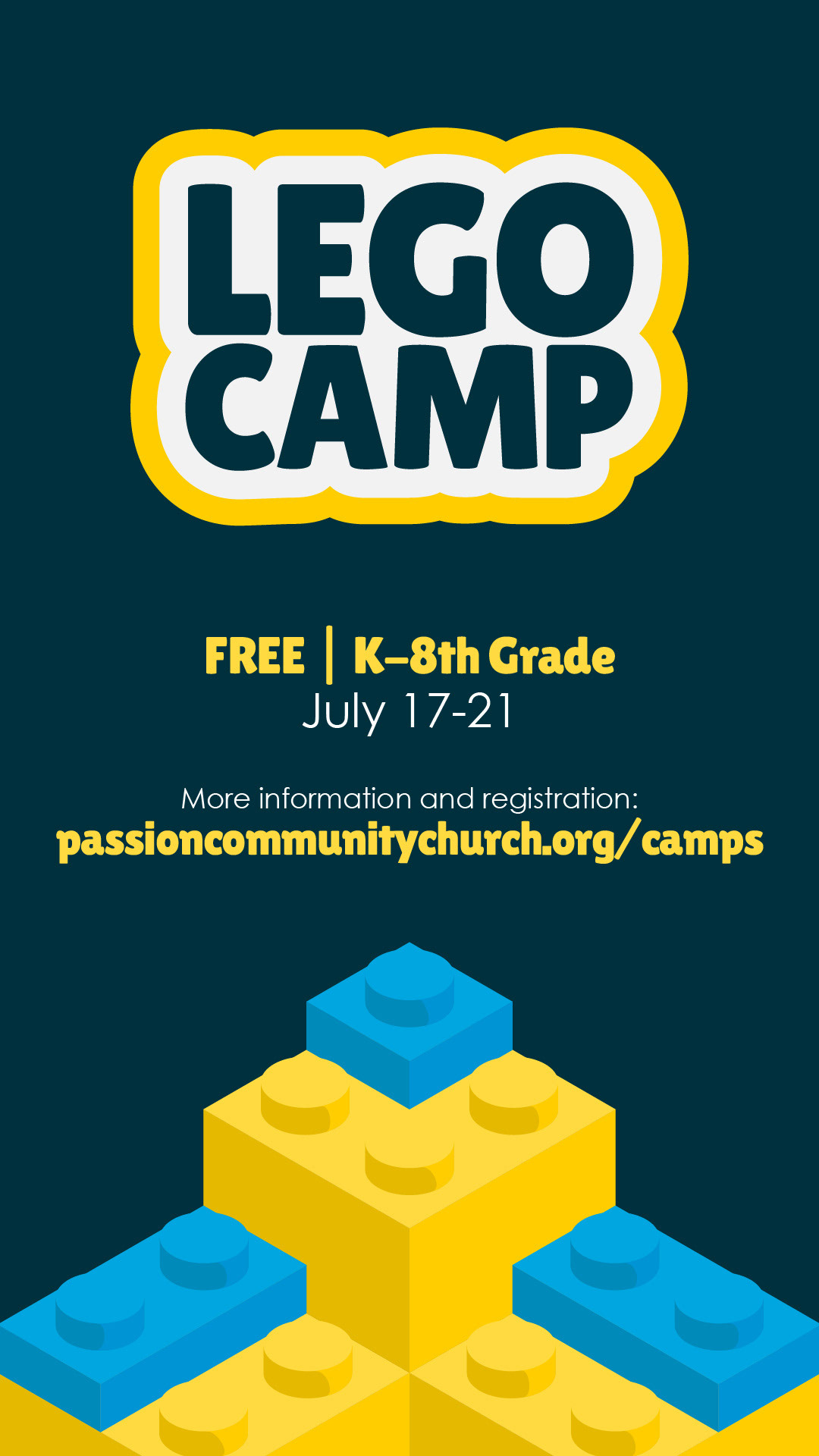
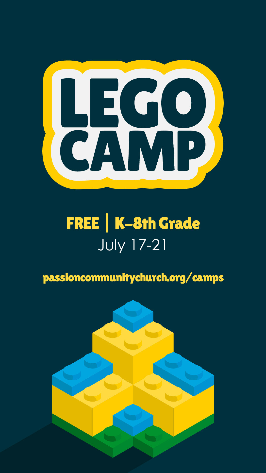
These are the promotional designs I created to be used by the church. The 16x9 design was made for use during the church service as an announcement slide. They also requested a square design for use as a social media post. Finally, the vertical design was made for use as a social media story and the composition had to be changed just a little to fit that size.


As a final component of this project, the church wanted to run a paid social ad in order to try and bring in people from the community. They created a stop motion video and so I created an end slide animation/transition to use at the end of the ad.
To match the stop-motion aesthetic of the video I expanded my original isometric asset by making it from different viewpoints so that it could rotate on the end slide. I adjusted the composition of the original vertical story design just a little to accomodate these rotating bricks. I also created the text animations to be more jumpy rather than smooth to also match the stop-motion aesthetic.
(The video and initial text in the video were not done by me. I only created the end slide animation to be added on to it)